7 Best Practices for Data Visualization
Data visualization: The visual depiction of numerical data using different graphs, charts, and maps is known as data visualization.
It's critical to follow specific data visualization best practices since they're fundamental in comprehending vast volumes of data.
You will become a more successful communicator if you visualize your material using several graphical ways.
Data visualization is a valuable technique for organizing your data for various sectors, from marketing to finance.
On the other hand, specific rules to follow may result in a more accurate depiction of your data and a more effective transmission of the message you're attempting to communicate.
Here are seven data visualization best practices to help you display data successfully and present it in an aesthetically beautiful and readily understandable way.

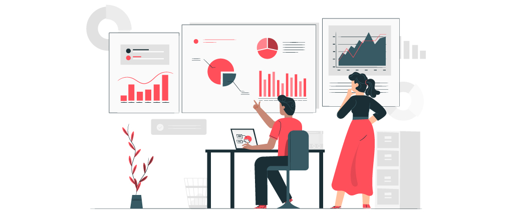
The Benefits of Using Data Visualization Techniques
Before we begin, it's critical to understand why adhering to these ten data visualization best practices is vital. As previously said, data visualization is the process of turning facts, figures, and statistics into an aesthetically consumable graphic. However, there are specific recommendations to follow to guarantee that your data is as simple to grasp as you want it to be. These top ten data visualization best practices can help you create visually attractive and thorough charts, graphs, infographics, and more.1. Determine Who You Want to Reach
Identifying who you're showing the data for, i.e., the target audience, is the first stage of inefficient data visualization and communication. This might assist you in customizing your approaches and methods for a specific audience. Marketers, corporate executives, social media managers, entrepreneurs, educators, students, and non-designers are some examples of possible target audiences. To ensure that everyone is on the same page, you may build a graphic to identify and represent your target audience. The way you show data must be clear and intelligible to the target audience for them to digest it quickly. Problems arise when the image's interpretation differs significantly from the conveyor's intent since mixing and matching representations muddles things. Early in the design phase, it's critical to identify the target audience and present the visualization's fundamental idea. This goal should be reflected in the visual's graphic design. Although those familiar with the process may recognize the statistics in your visualization, others unfamiliar with the information may find it difficult to separate the facts from the data if the data is not displayed and clearly.
2. Ascertain that your data is error-free
Before you transform your raw data into a graphical representation, be sure the dataset you're using has been properly cleansed. The act of weeding out any irregularities or inconsistencies in your dataset is known as data cleansing. Before you utilize the data for another reason, you must go through this procedure since the existence of these flaws might distort the findings of your data interpretation. If you want to publish a figure in a journal, make sure your calculations are correct and that all critical information is shared with a larger audience. Because the goal of this scenario is to explain the theory, student audiences need special care. In such a scenario, you'll need to go further to ensure that the concept is fully grasped. Because you must build a basic, probably tentative graph that illustrates the most crucial feature of your study, a broad audience might be the most demanding audience.
3. Choose the Correct Chart- Data Visualization
 Once your data is clean, you may choose the style of graph or chart that will most effectively and efficiently express the essential information in the dataset.
As you can see from the following points, there are many different forms of information that various charts may represent:
Tables can organize a lot of data, but they may also confuse consumers looking for high-level trends.
Line graphs show the interaction between two or more variables by measuring fluctuations or patterns across time.
Bar charts compare and contrast the quantities and totals of various categories.
Scatter plots show the relationship between two variables shown along two axes, with the pattern of the associated dots indicating a connection.
Different areas of one data set are evaluated using pie charts and donut charts, simply a pie chart with a hole in the center.
Individual values in the matrix are translated as color in heatmaps, which visually represent the data.
Natural Language Generation (NLG) is a way of producing natural language via natural language processing.
It may represent information in text form graphically and translate data.
Once your data is clean, you may choose the style of graph or chart that will most effectively and efficiently express the essential information in the dataset.
As you can see from the following points, there are many different forms of information that various charts may represent:
Tables can organize a lot of data, but they may also confuse consumers looking for high-level trends.
Line graphs show the interaction between two or more variables by measuring fluctuations or patterns across time.
Bar charts compare and contrast the quantities and totals of various categories.
Scatter plots show the relationship between two variables shown along two axes, with the pattern of the associated dots indicating a connection.
Different areas of one data set are evaluated using pie charts and donut charts, simply a pie chart with a hole in the center.
Individual values in the matrix are translated as color in heatmaps, which visually represent the data.
Natural Language Generation (NLG) is a way of producing natural language via natural language processing.
It may represent information in text form graphically and translate data.
4. Make Effective Chart Labels
 Graphs and charts may help us rapidly see trends in our data. On the other hand, labels are the most excellent approach to express specific values that may be significant graphically.
You can't explain everything with only the figure, whether you're discussing an experimental setting, introducing a new model, or presenting new data.
This is why your figure should always be accompanied by a caption. The caption explains how to understand the image and adds accuracy to what can't be conveyed physically.
This is similar to clarifying an oral presentation or in front of a poster, with the difference that you should prepare ahead of time for the questions that will be asked.
Graphs and charts may help us rapidly see trends in our data. On the other hand, labels are the most excellent approach to express specific values that may be significant graphically.
You can't explain everything with only the figure, whether you're discussing an experimental setting, introducing a new model, or presenting new data.
This is why your figure should always be accompanied by a caption. The caption explains how to understand the image and adds accuracy to what can't be conveyed physically.
This is similar to clarifying an oral presentation or in front of a poster, with the difference that you should prepare ahead of time for the questions that will be asked.
5. Highlight the Crucial Points
 The audience must follow the narrative you attempt to tell by looking at your chart in data visualization.
This is why using visual signals like reference lines or highlighted trends to draw the reader's attention is so important.
Visually, humans can take a greater quantity of information. Our gaze is attracted to symbols that provide essential information in a single glance.
We look for patterns because it's tough to understand the picture if the designs are chaotic or nonsensical.
Make sure that the sequence or manner in which you present the facts makes sense to your audience to draw on these human characteristics. You may utilize numeric, alphabetical, or sequential data.
If you're attempting to convey information in a language that reads from left to right, for example, make sure your data visualization follows suit.
Make that the arrangement of the graphs in a single infographic is correct and the relationships between the data are apparent. This prevents the audience from becoming confused as they go from one chart to the next.
The audience must follow the narrative you attempt to tell by looking at your chart in data visualization.
This is why using visual signals like reference lines or highlighted trends to draw the reader's attention is so important.
Visually, humans can take a greater quantity of information. Our gaze is attracted to symbols that provide essential information in a single glance.
We look for patterns because it's tough to understand the picture if the designs are chaotic or nonsensical.
Make sure that the sequence or manner in which you present the facts makes sense to your audience to draw on these human characteristics. You may utilize numeric, alphabetical, or sequential data.
If you're attempting to convey information in a language that reads from left to right, for example, make sure your data visualization follows suit.
Make that the arrangement of the graphs in a single infographic is correct and the relationships between the data are apparent. This prevents the audience from becoming confused as they go from one chart to the next.
